paw cha
brand identity and branded collateral
OVERVIEW
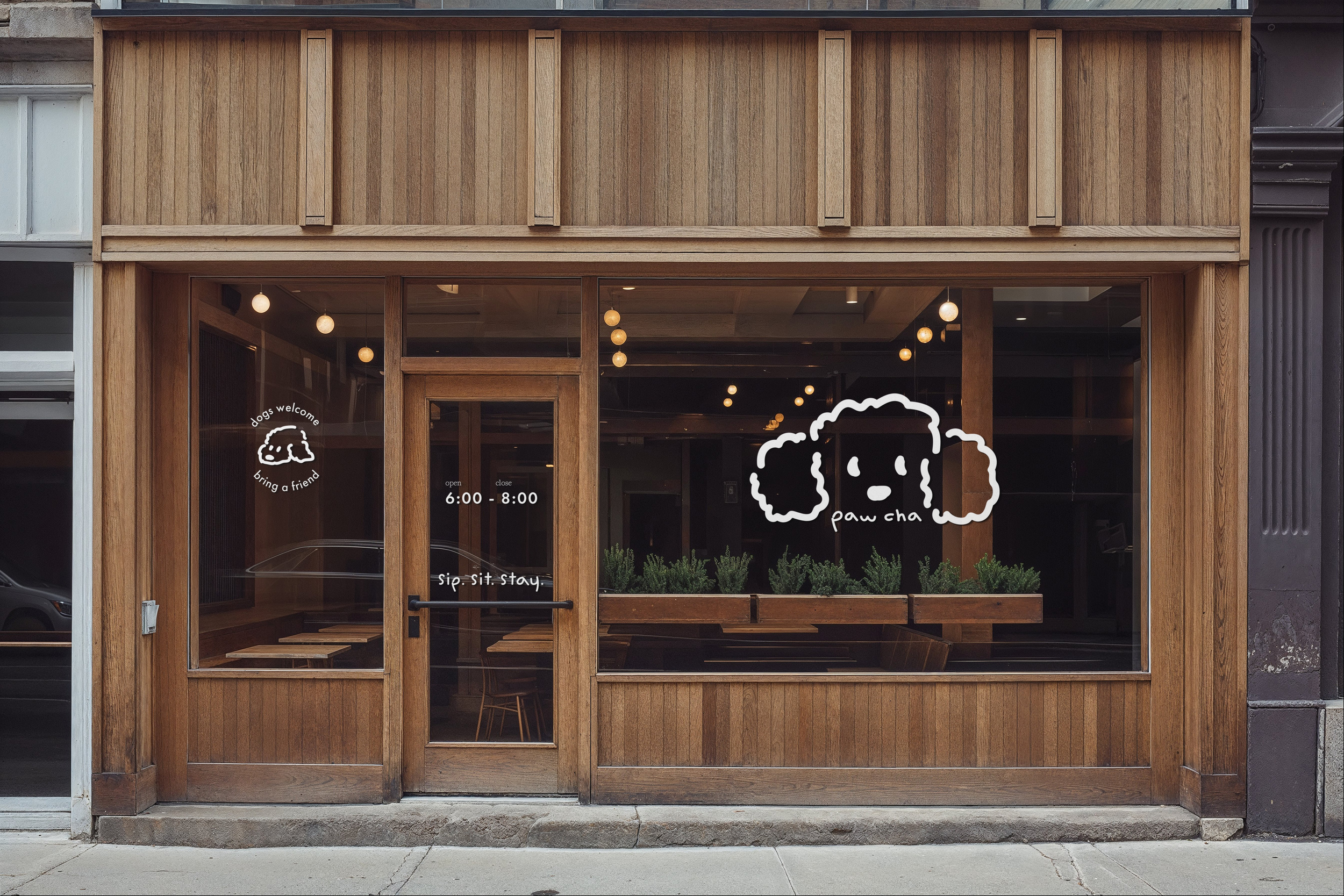
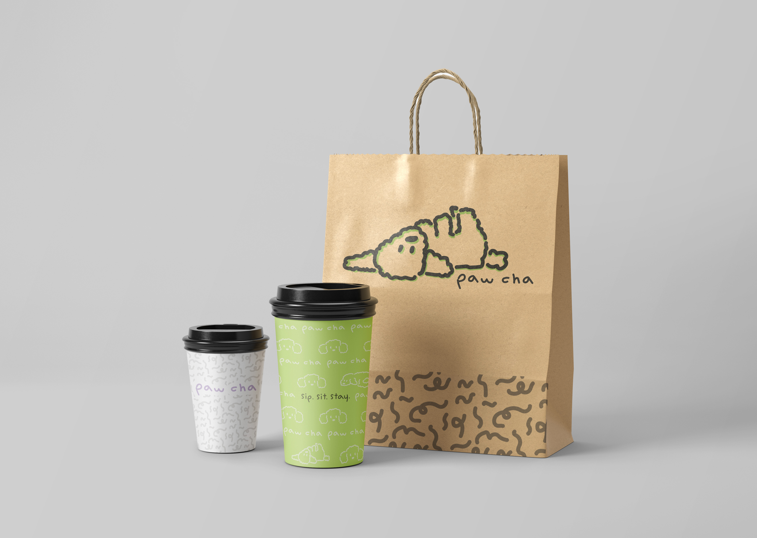
PawCha, a dog-friendly matcha cafe, that is organic, mellow, and humanist. The tagline is “Sit. Sip. Stay.”, the kind of place where you don’t have to leave your furry friend at home for, whether it be for work, school, or just to get a fun drink.
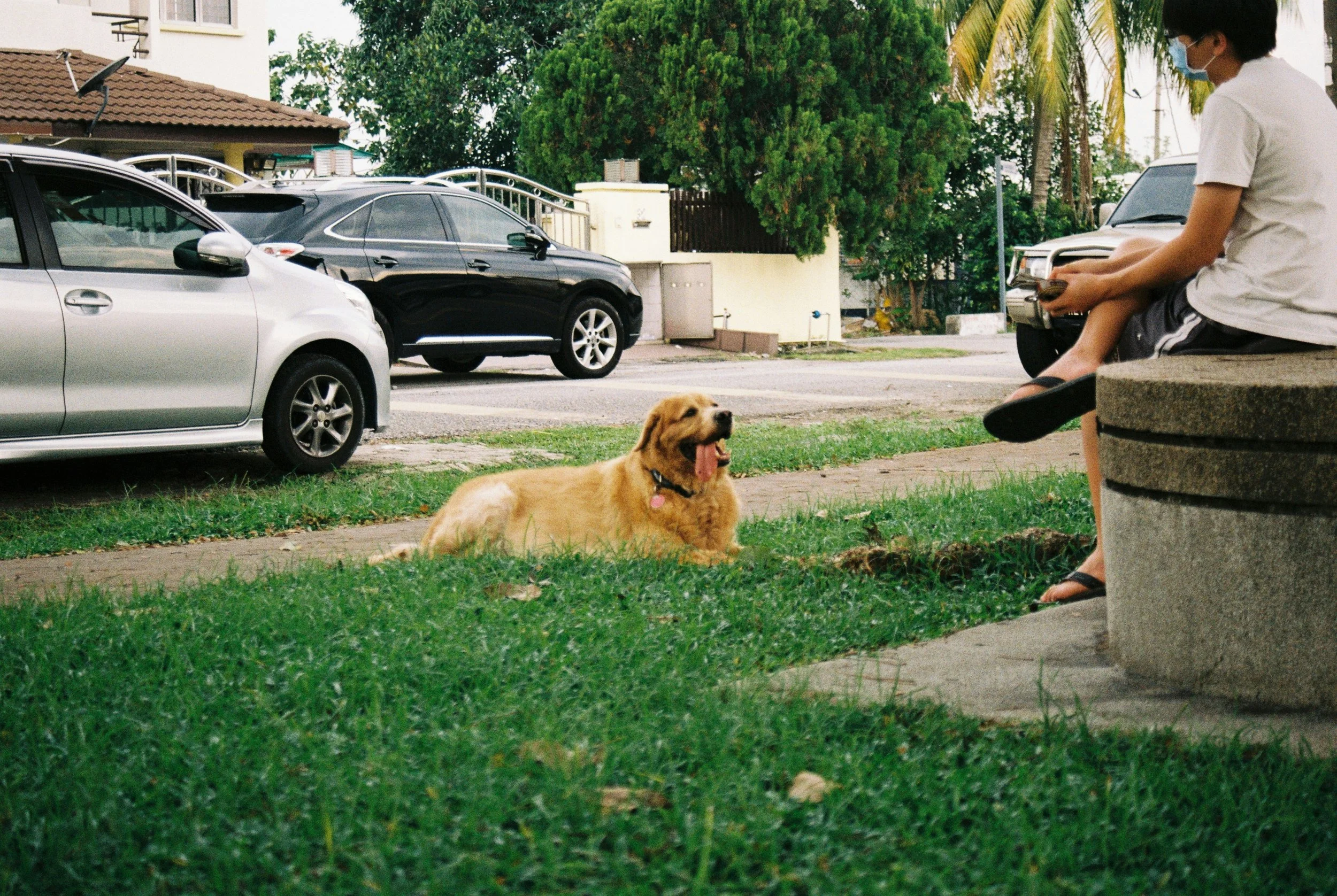
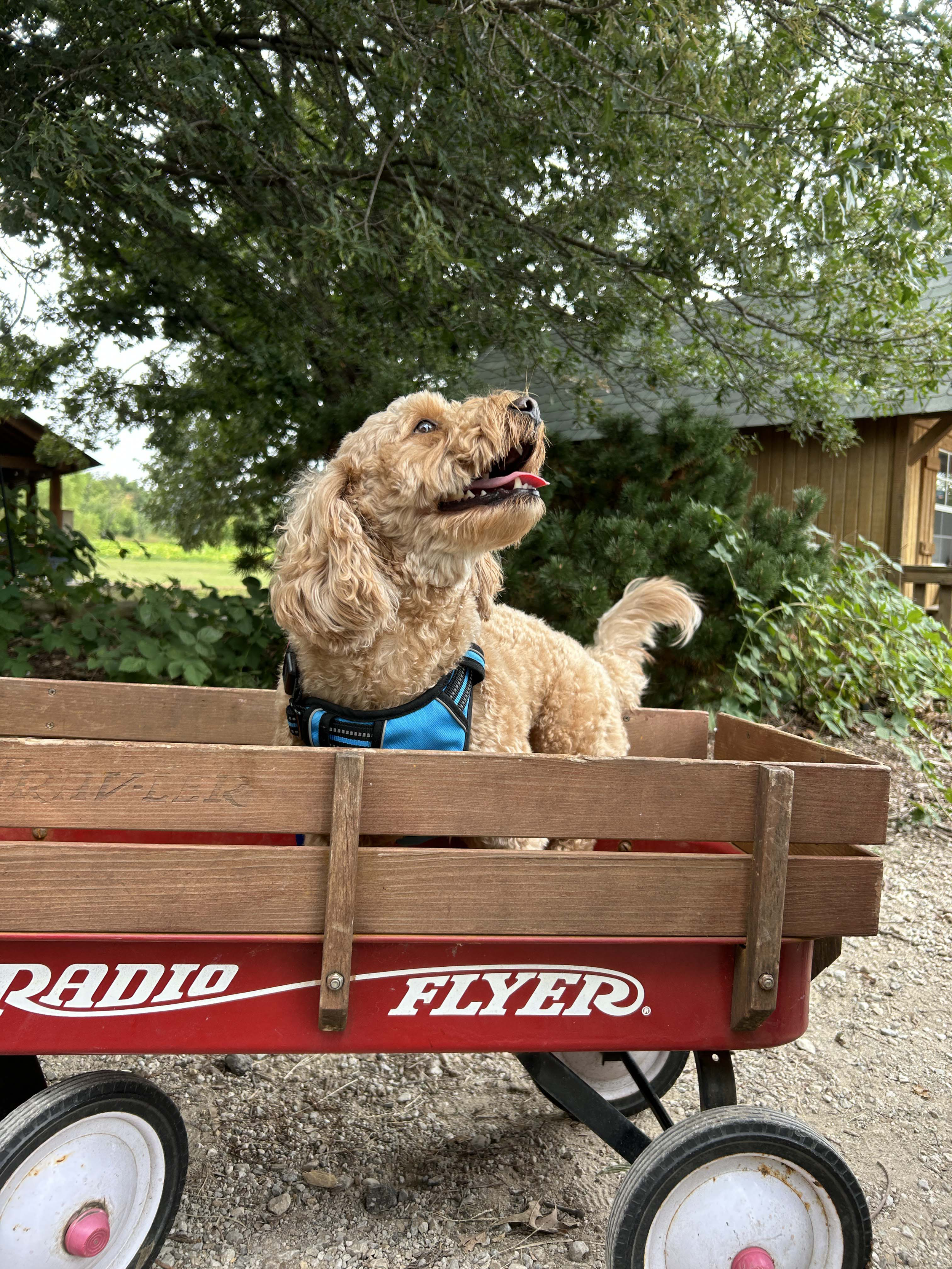
skyler's dog monty, inspiration for the logopreliminary logo sketches
process
This brand’s values best suit a hand-drawn logo, to give it a sense of creativity and whimsy. The logo’s inspiration is from my dog, Monty. The rough edge shows the brand’s humanist qualities, while still being rounded, represents friendliness. The close-up of the face conveys simplicity and ensures the logo is easily read. This logo becomes the mascot for the brand, showing up in many supporting elemenTS.
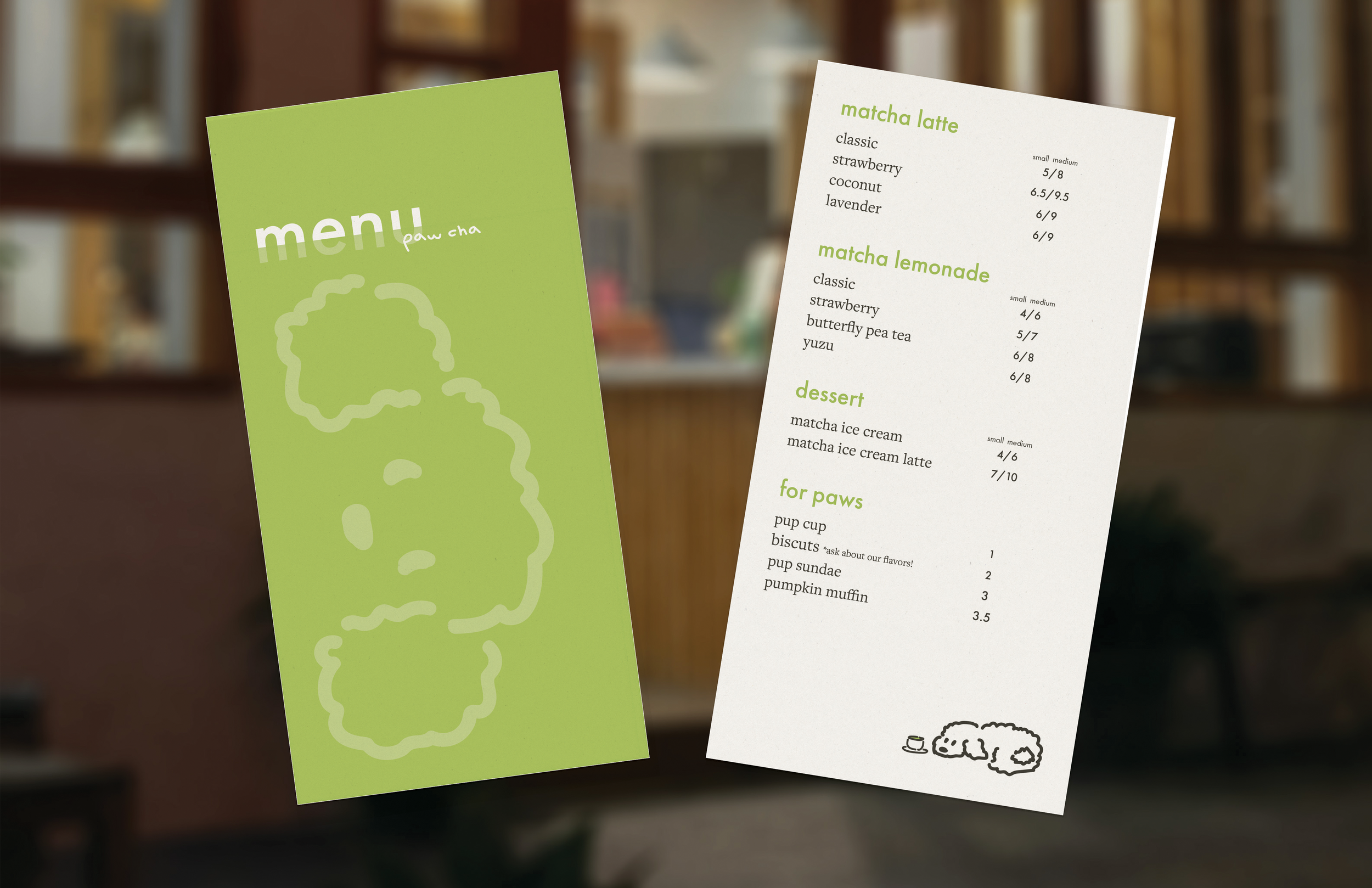
Patterns, graphics, and color palette
dog treats in three different flavorstote bag sold in store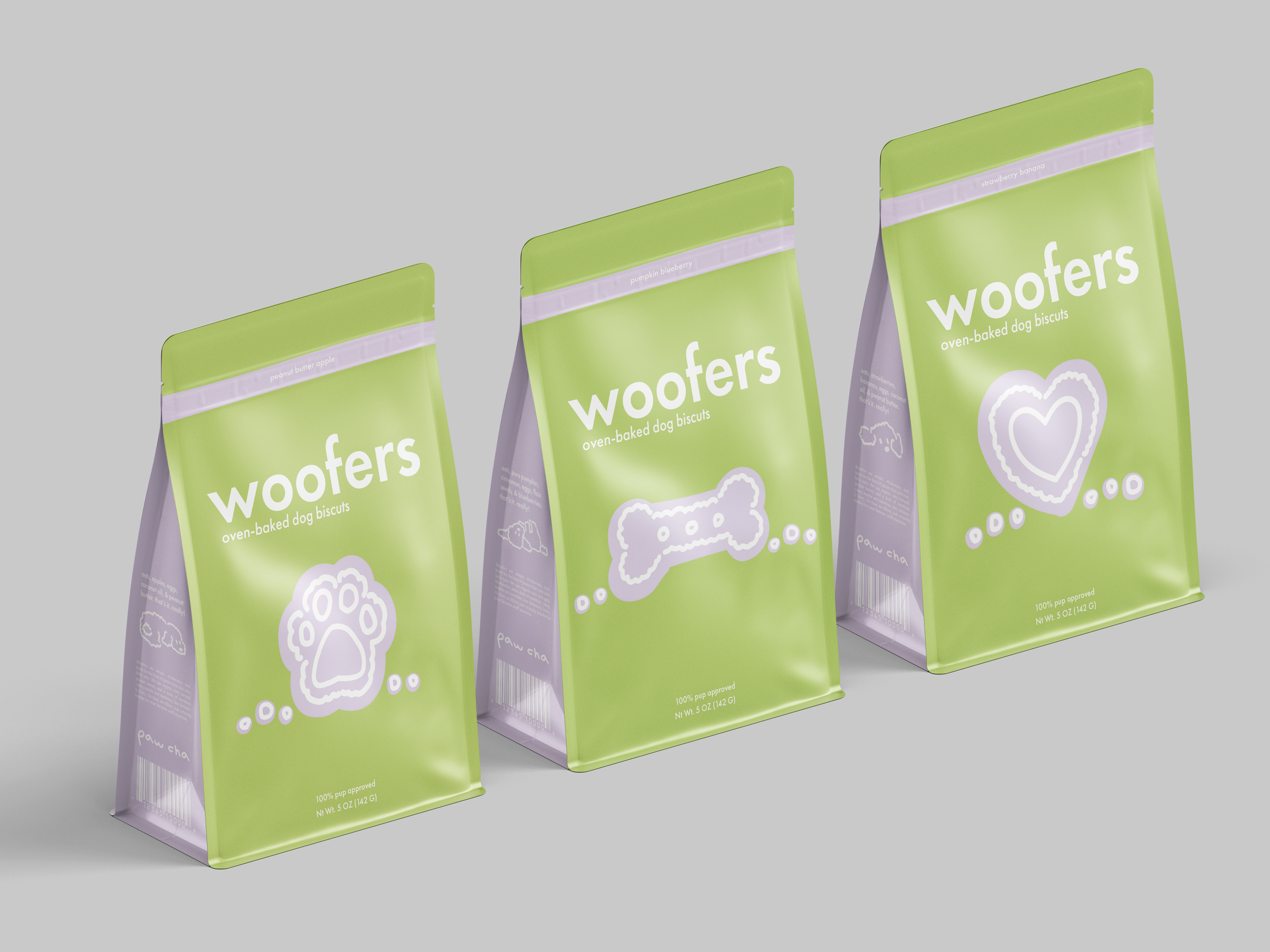
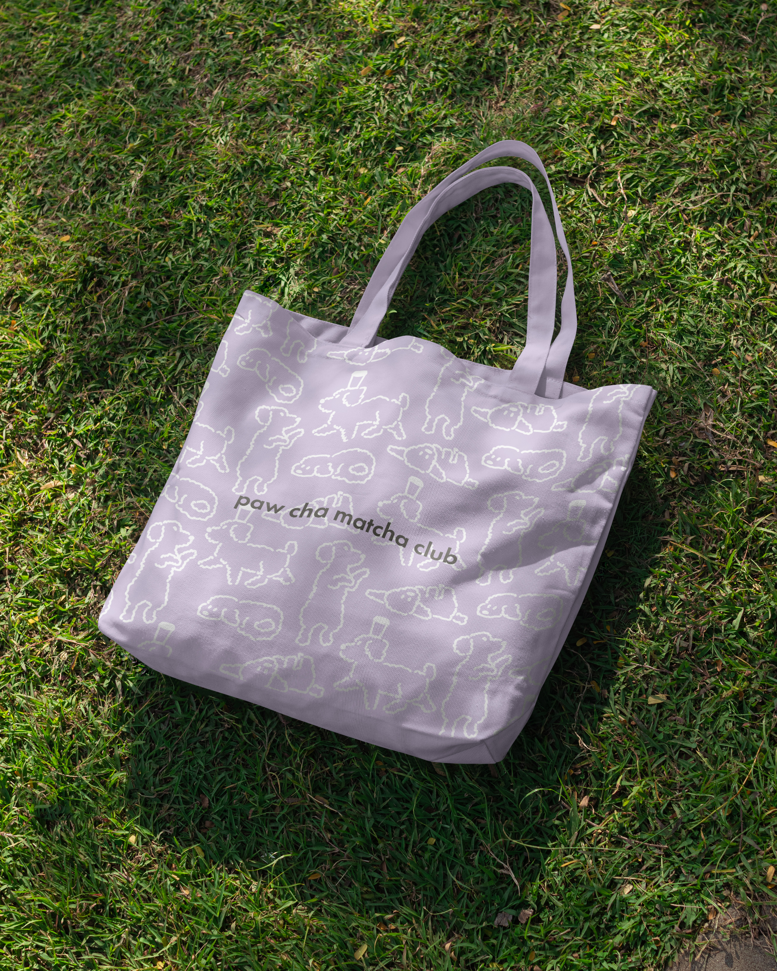
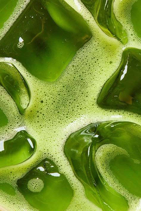
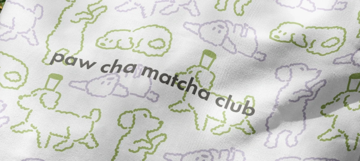
The green acts as the main color, brown is used for contrast, and purple is used as an accent. The softness of the two main colors against the darker, muted brown gives it an approachable feel. The pattern represents curly dog hairs and goes cohesively with the look of the logo. The supporting graphics have the same feel as the logo and typography, appearing consistently throughout the brand.
storefront of matcha cafe