true grain
brand identity, packaging, web advertisements, and social media
overview
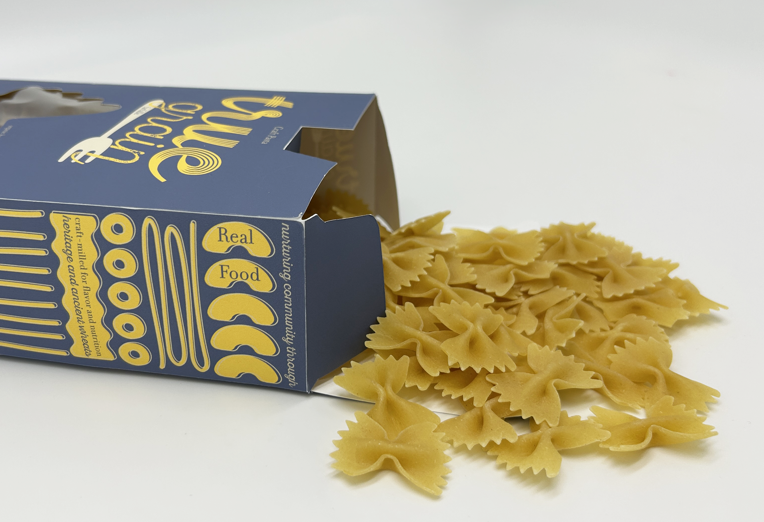
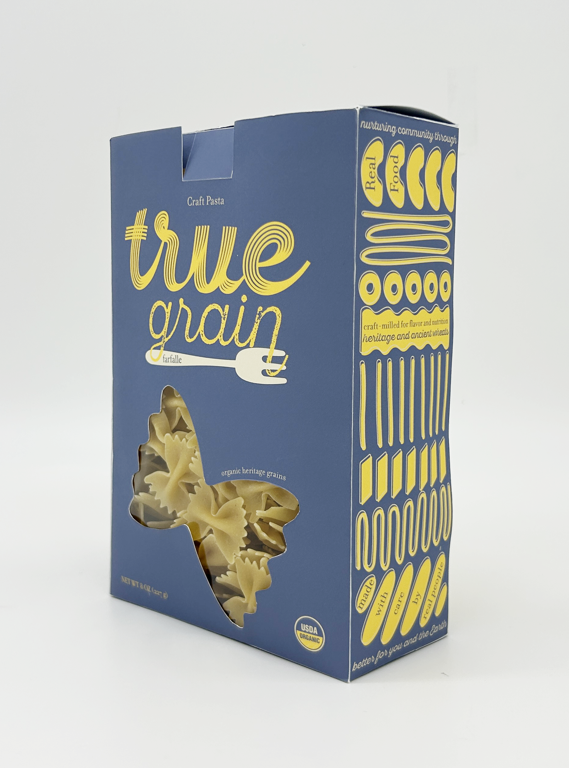
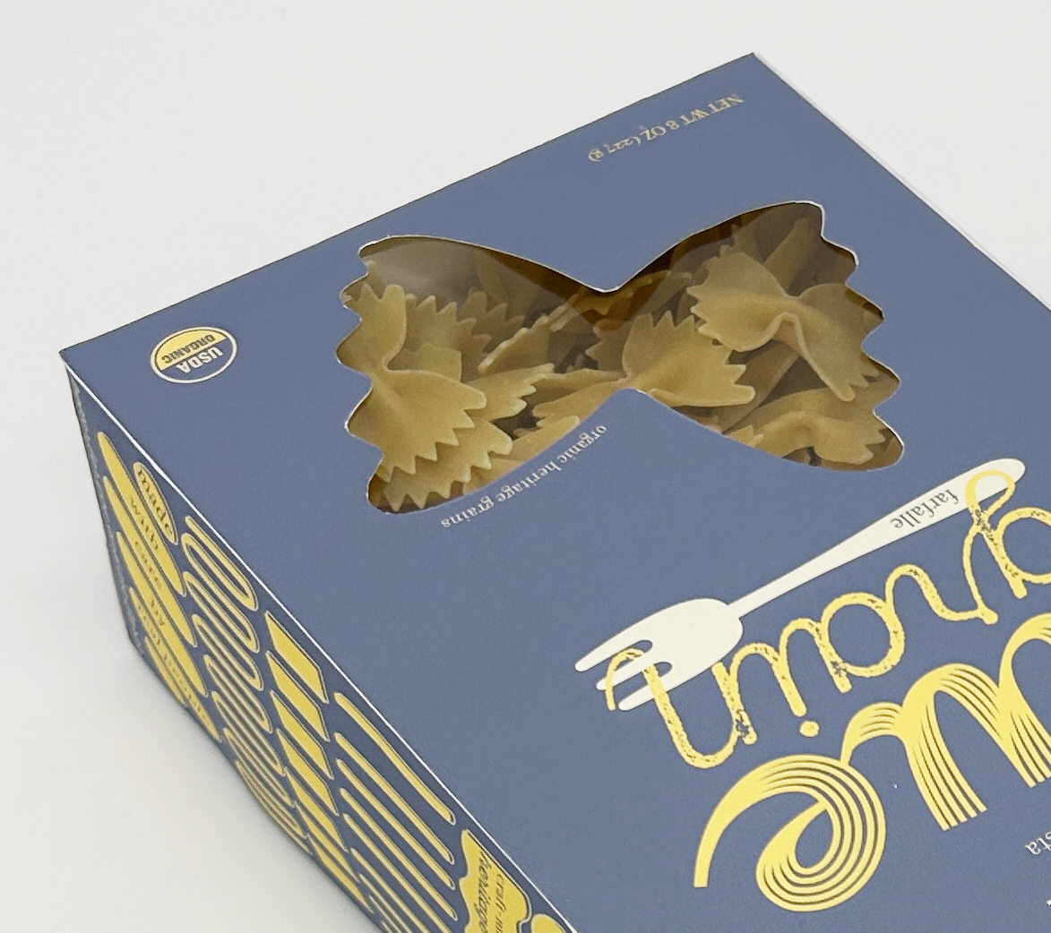
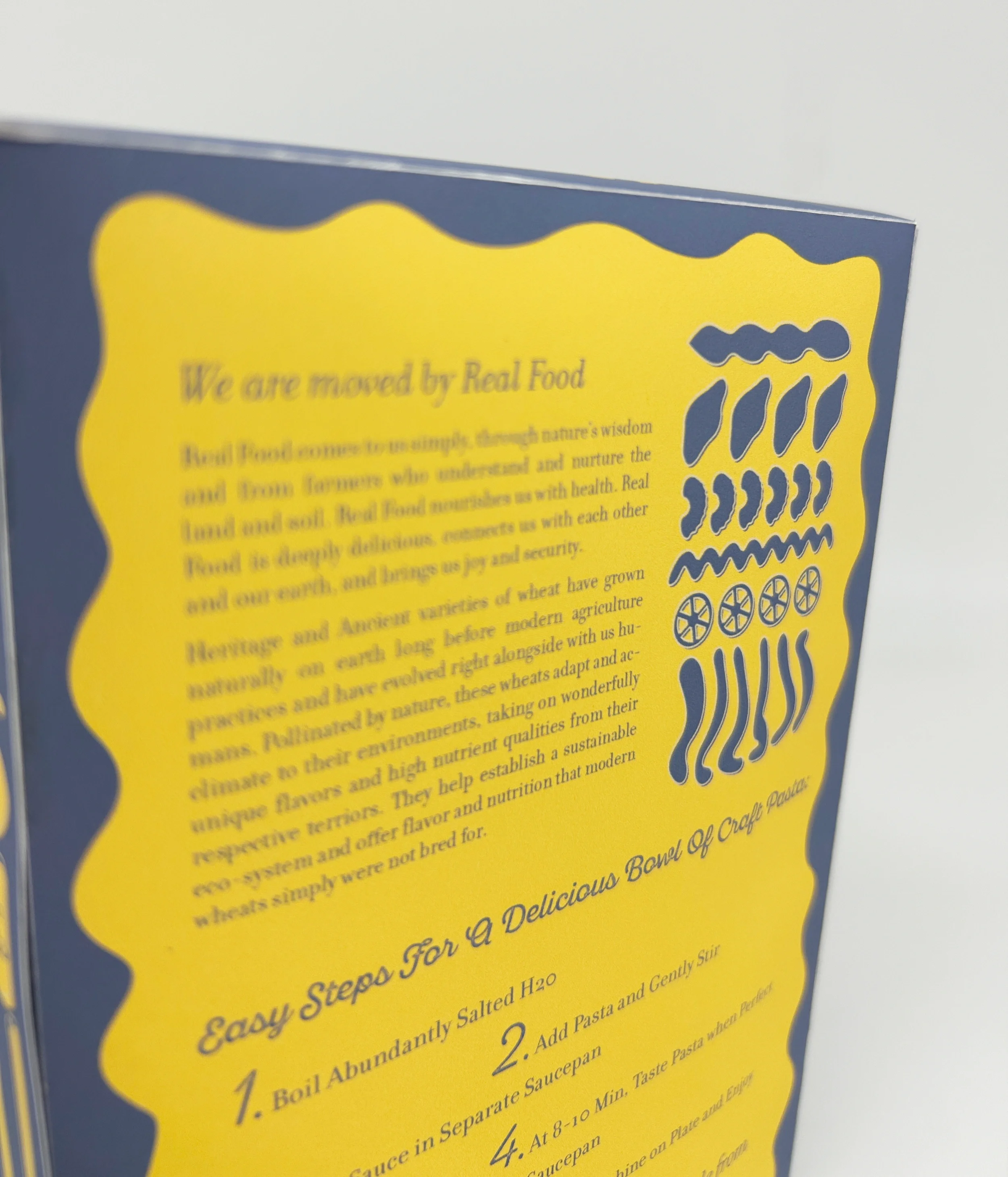
Transform True Grain, an all-natural pasta brand, packaging to convey the characteristics of craft and organic, while maintaining friendly and hipster elements. Three spot colors were used throughout the packaging and branding. The logo is an ode to pasta itself, with individual noodles creating the word true and the twirl of spaghetti on a fork. The pasta pattern on the side and back creates subtle interest for the audience, as well as the storytelling.
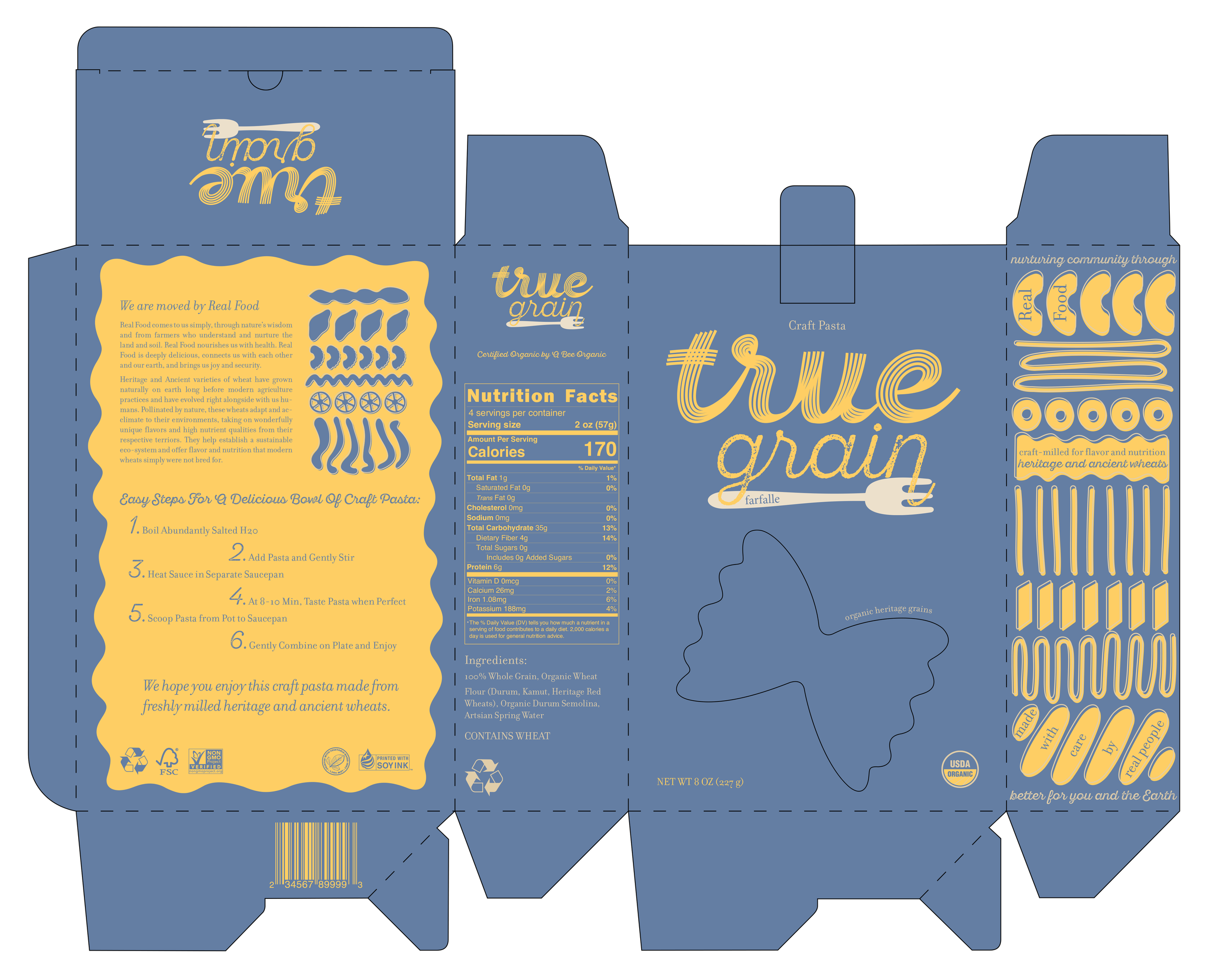
pattern inspired by pasta shapes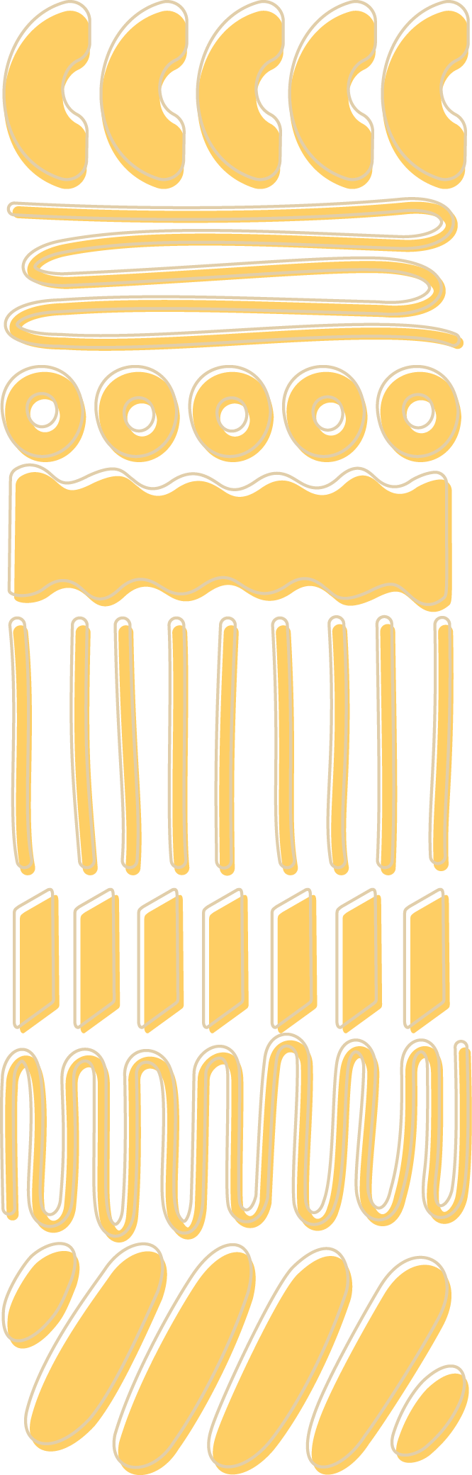
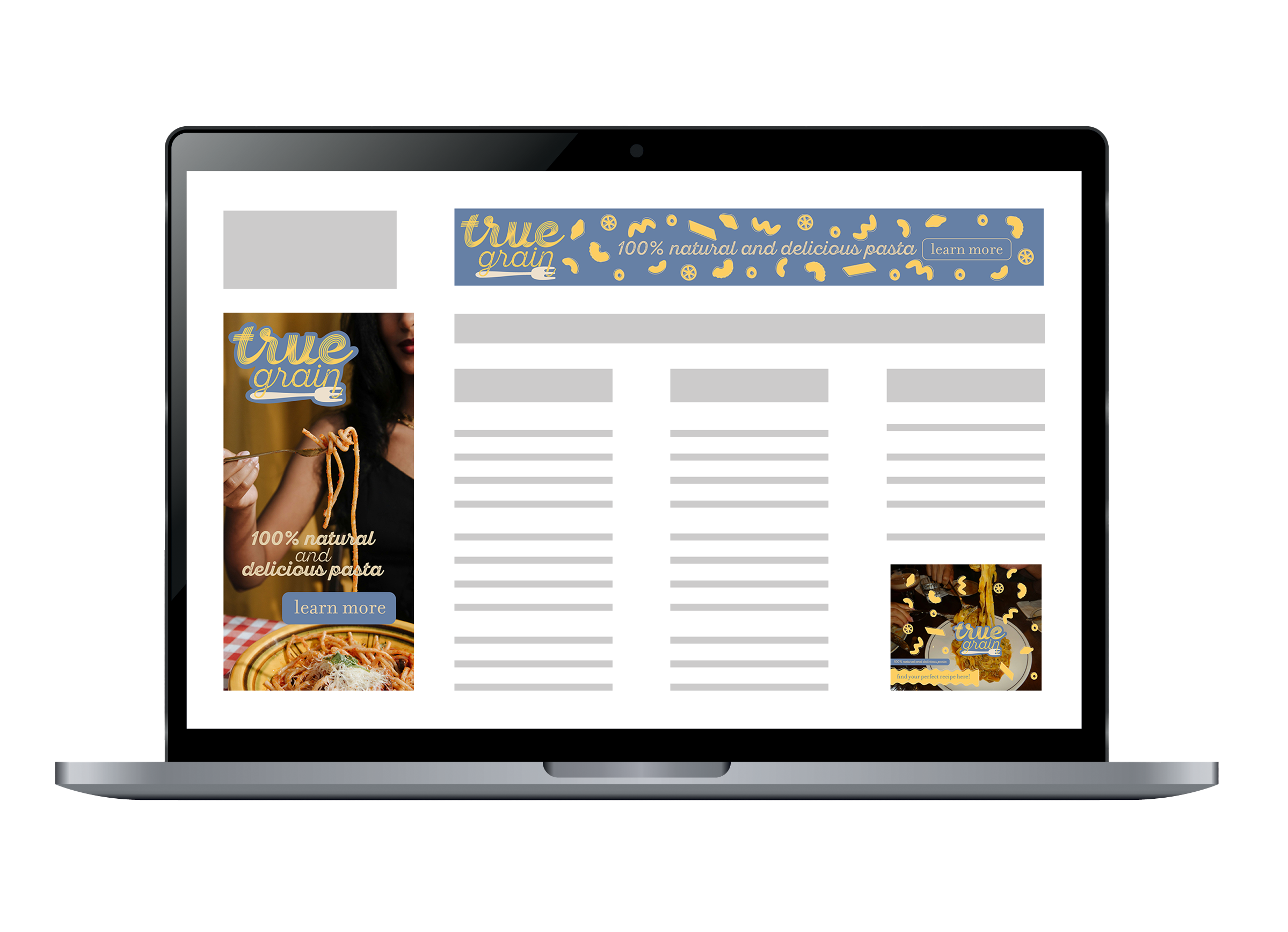
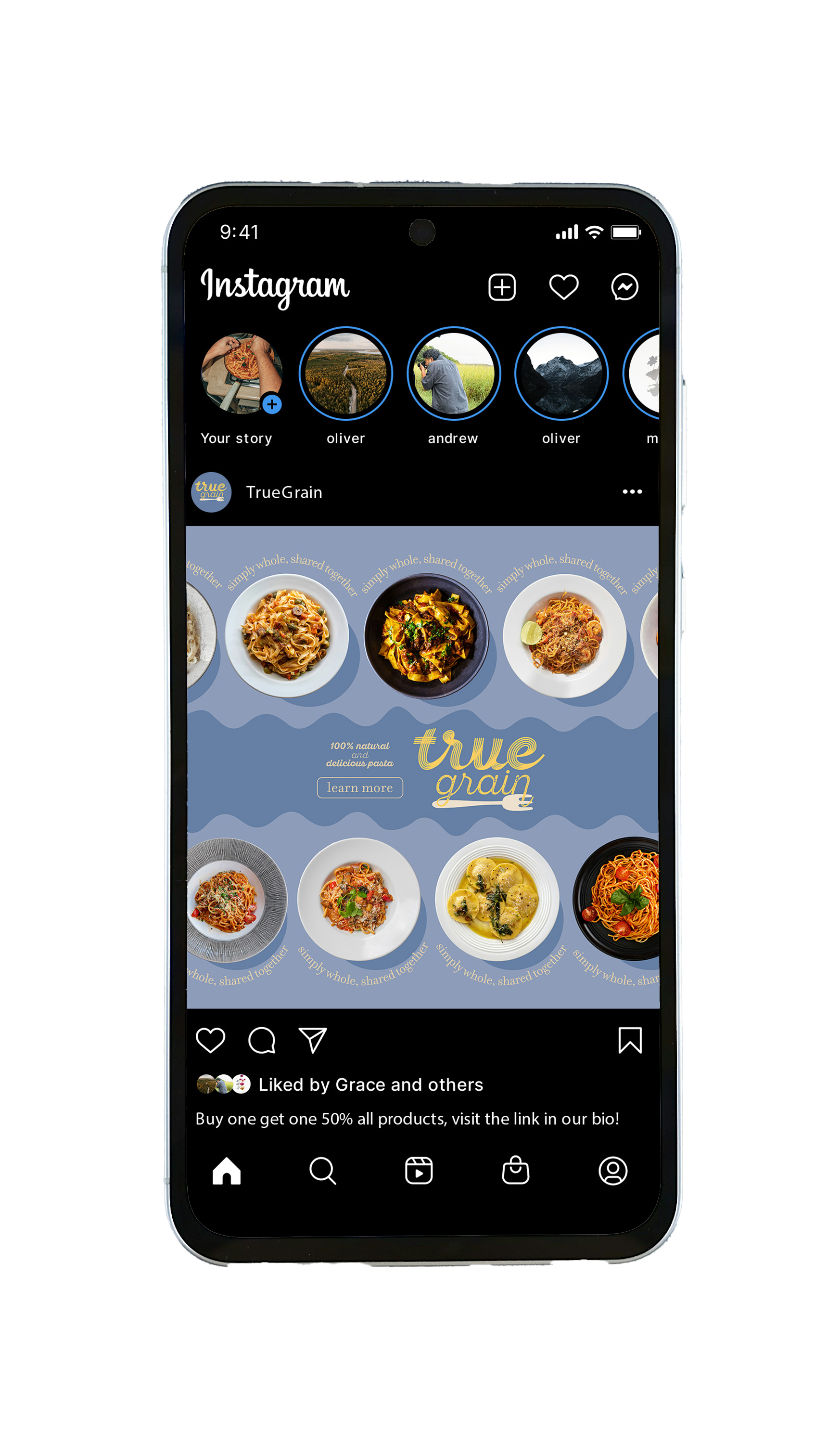
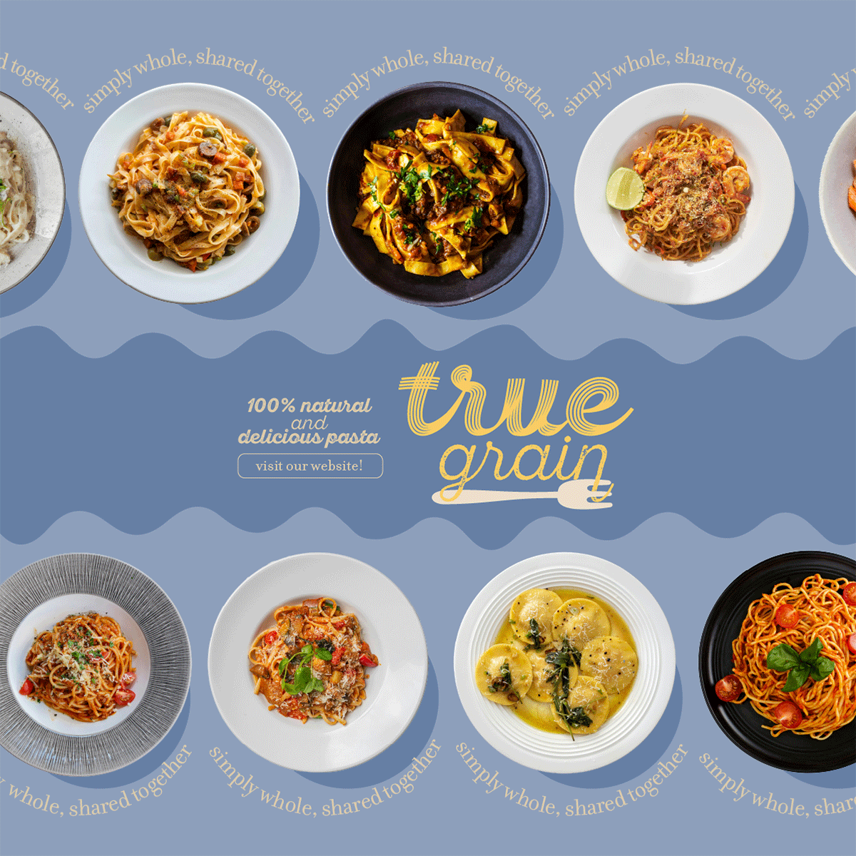
ads & social
Create social media advertisements that align with True Grains’ values. Each advertisement is sized differently, including a large leaderboard, a small rectangle, and a vertical rectangle. They feature brand elements and a call to action for the audience, people who are health-conscious. This process included preparing files that are sized correctly for web use in RGB color space.